


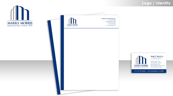
Client: Marks Morris Construction
Industry: Construction / General Contractor
Project Scope: Logo Development, Business Card, and Letterhead
Comments: The client wanted to re-brand the company to reflect a more established professional image. The logo uses two “M”s to create the shape of a building facade which rests on a firm foundation, formed by the Marks Morris name. Blue and grey are colors that instill a feeling of trust and also communicate an established, masculine feel. Font has a traditional feel with a slightly modern element, representing both the history and future of the company.
Home • Services • Strategy • Portfolio • Bio • Testimonials • Contact